Translate

Showing posts with label mixing. Show all posts

Wednesday, February 11, 2015

Photographs and Sketches May Refresh Your Last Great Idea!

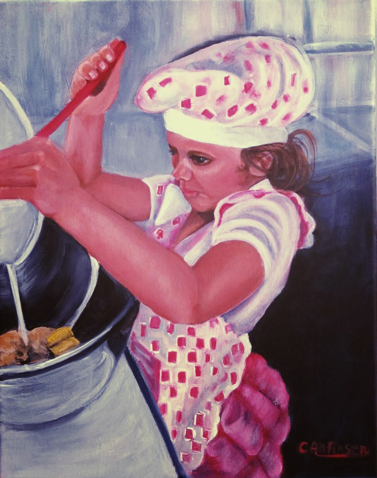
"The Cook" 11x14 acrylic on canvas
I delight in painting children. There is such a freshness and openness in their faces. No masks to hide emotion. No walls to put distance between them and us. Their innocence invites us to experience life anew as we once did when we were children.

My latest painting took me much longer to complete because of health issues. I didn’t want to clutter the background with details that would take the viewer’s eyes away from the center of interest. Don’t get me wrong, I’m a fan of “busy” paintings. I like to spend time wandering through a scene and taking it all in. Restaurants, unusual rooms, people involved in talking or working are some of my favorites.
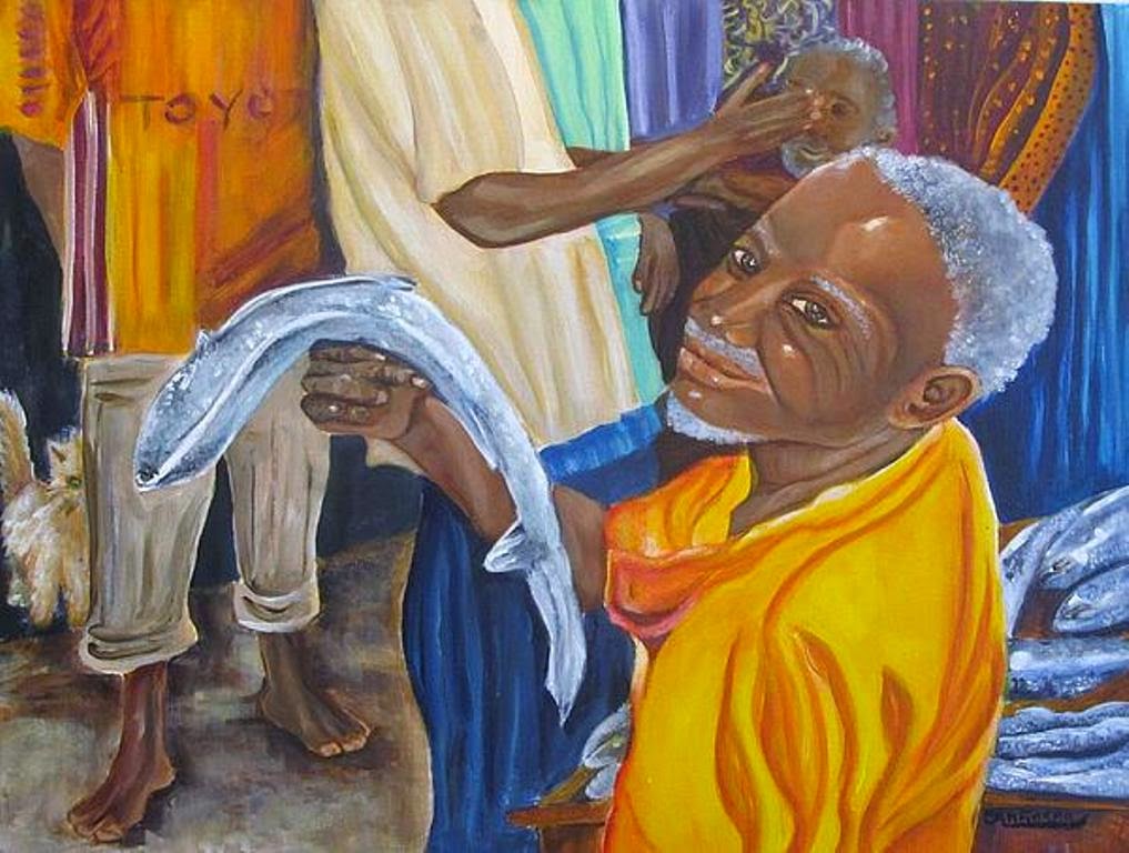
"Fish Market" acrylic on canvas
(When I did this painting, an artist friend scolded me for putting in too much detail -- I ignored her. The
painting did get in a juried gallery so I was pleased!)
But there are times when the main event can get lost in too much detail. One of my favorite artists is K. Henderson who knows how to use detail to her advantage. She works in oils but also uses watercolor and illustrates a journal that she shares with others.

Kay is a naturalist, artist and photographer. She travels extensively to areas such as Alaska, and as far away as Manitoba, CAN.  Her dialogue and her web site are well worth checking out if you aren’t familiar with her body of work.

Here is a link to her Indian portraits: http://khendersonart2.blogspot.com/  

This painting is another good example of an innocent child surrounded by the detail I love to paint.
"An Open Book" mixed media. Prints available.
I do a lot of photography in making painting and composition decisions. I file them away and review them when I'm looking for a certain detail or subject. Photographs can preserve memory. When you add it to a quick color sketch the scene you captured days or weeks before can quickly come to mind.
(the first slap of paint on canvas)
(I was going to reflect a beater but changed my mind)


Tuesday, February 11, 2014

Dark Secrets about Black, the Color Artists Fear

(black background on this oil painting) "Sandhill Crane" 
A myriad of artists on LinkedIn argued over, under and around the use of the color black. Most were taught not to use black at all, but to mix their own shades from other colors.
Renoir called black “the queen of all colors.” Black is loved. It is feared. Most artists prefer mixing their own black rather than using it straight from the tube. Color combinations such as yellow and purple or other premixed combinations and Payne's gray are more subtle. 
According to one of my favorite artists, Robert Genn, “black works as a darkener because it’s near chromal neutrality does not sully the color it grays. While scorned on a few snooty palettes, black is the loyal friend that helps make other colors look more brilliant than they are. Wise artists do not say derogatory things about black.”

(black background) "Sunshine" oil on canvas
Here’s the real scoop (according to Genn):
1.       "Lamp black is a pure carbon pigment made by burning oils and collecting the soot from flues. It's one of the oldest manufactured pigments.

2.      Ivory black, originally made from burning real ivory, is now a bone byproduct of the slaughterhouse.

3.      Mars black is an iron-oxide product that in many ways is more stable than the other blacks. It does not effloresce, maintains total integrity in oil and water-based media and, to my knowledge, is the only paint that's magnetic."

(I used Payne's gray and a light purple in the highlights) "With These Hands--Love" 24 x 18 mixed media
Genn continues: “Give black a chance. A challenge is to work with only black and white for a day. After a week one begins to feel the brilliance of black. As seasoned artists have found out, if it works in black and white, it works.

“Try the method of grisaille--a monochrome painting executed in shades of gray. Used as an under-painting, grisaille was first popularized by the Northern Renaissance artists. These days, using bright white grounds and a range of grays, full value can be had by glazing with acrylics or other media. In painting, black is mother of learning.”


I did my own grisaille mini-paintings in a class on portraiture. I was amazed with the results at how life-like the models and forms appeared. It’s a great way to learn about value and shading.

(I had more difficulty with this one in the class. You can see it's not as fresh and loose as the first one)
“Timid souls use Payne’s Gray” Genn wrote. I gulped as I read this since Payne’s is my color of choice. 

Well, this timid artist is going to “break out.” I’m going to test the waters and use more black. If Genn is right, Mars black seems like the better choice.

"India Rising -- the Lost"  24 x 18 mixed media on canvas (I used Ivory black and Payne's gray)